
03 Nov The Color of the Countertop
Tips for establishing the perfect hue for your kitchen
When it comes to the kitchen and having the perfect ideas that best complement the style, it is important to choose the right color for your kitchen countertop installation. When you want to decorate the room it may be the most relevant choice you make. You need to factor in the overall style of your home, 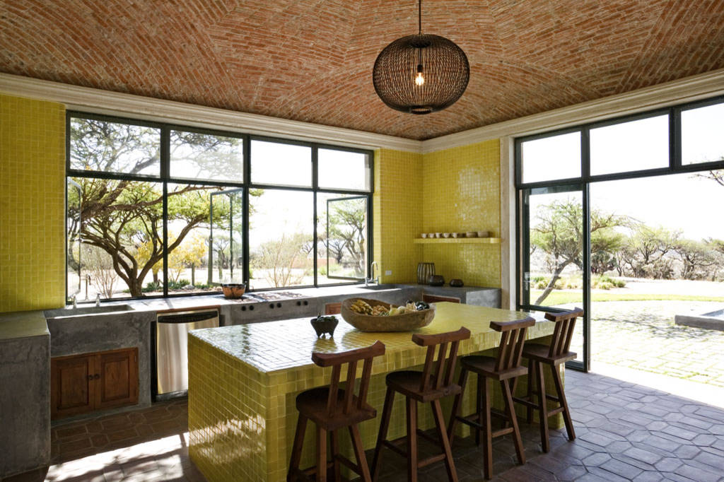 how often you actually use the countertops, as well as your personal tastes and what you hope to achieve. Obviously you first need to choose the material you want for your countertops. Then it’s time to determine the color. But how do you do so? How do you make the wisest choice that will prove to be the most effective? Think of it like this – you are setting the tone for a theme.
While you sort through the wealth of choices available to you be mindful that you’ll be matching the countertop color to the color scheme of the kitchen. However, also consider that paint and accessories will be changed over time. You can find an excellent match, but what if you decide to change the color of the room shortly thereafter? Sure, it’s not likely to happen, but tastes do change. But the truth is, the stronger or brighter the color you pick for your countertop, the quicker it will become vulnerable to being prematurely outdated. So don’t use paint or accessories as your primary reference to match from. Instead, utilize a shade that is found within the subtle realm of your favorite color, this will enable you to keep your options open.
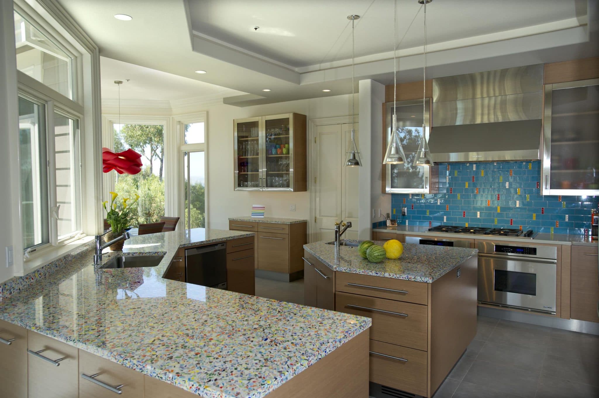
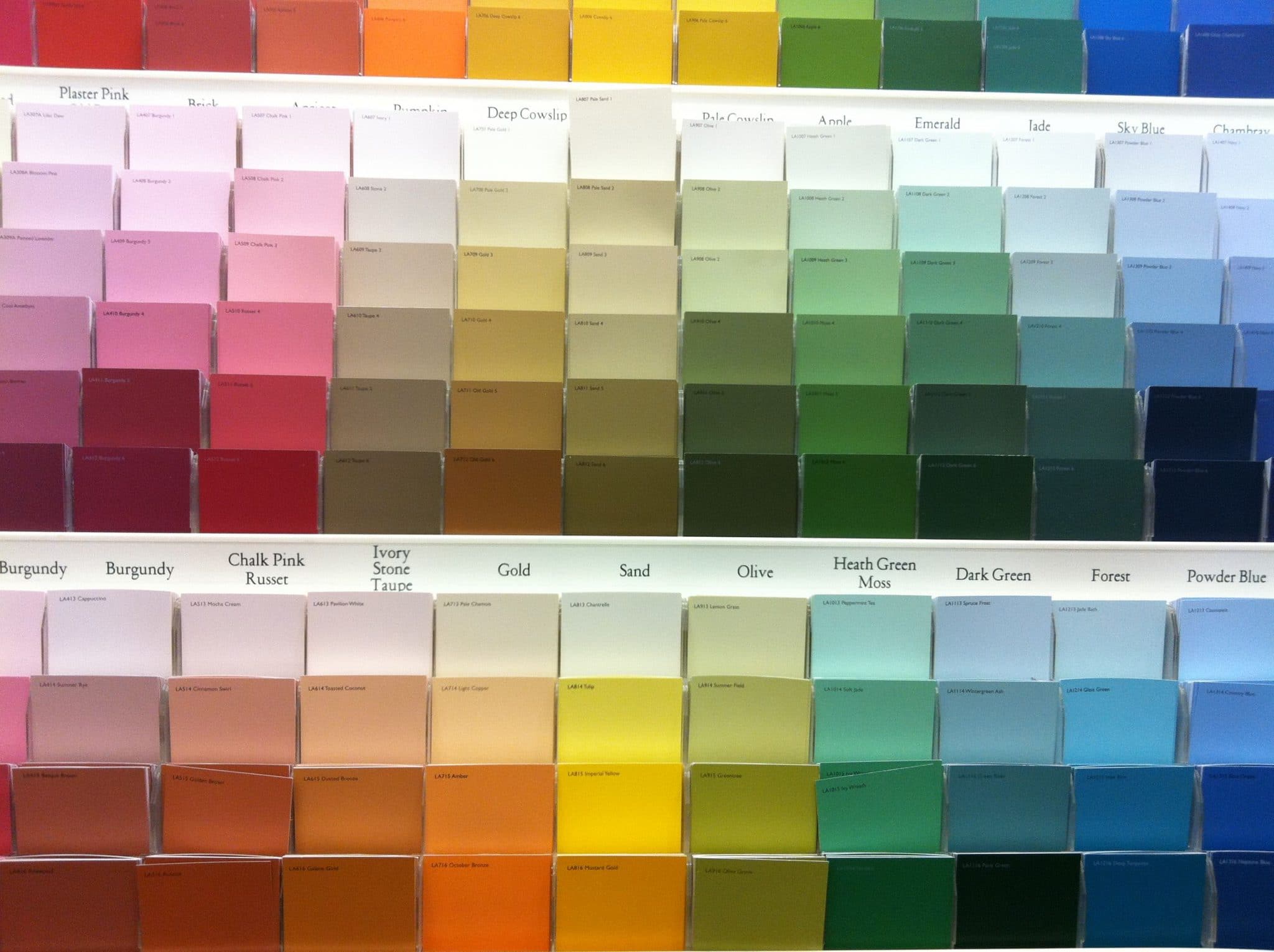
Mixing two or more colors together will create a new color – one that is known as the “undertone”. Pay special attention to the rooms color undertones. Depending on how you deal with them they can be either good or bad to your aesthetic sensibility. Use a color wheel for a better understanding of what is essentially a decorative science. For instance, if your countertops are blue or green they will make cherry red cabinets appear too red or even pink. It’s all reactionary, the process of how colors bounce off one another. If you want some flash of spectacle without overdoing it with an overly dominant color, try instead a speckled countertop. It will give you the pops of color you desire without the overbearing sense of it.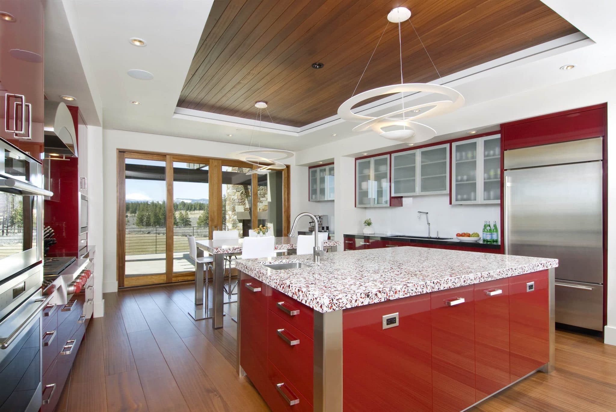
Undoubtedly, your best bet is to sample your paint choices before making a final decision. Don’t settle on something you see in a store on a paint strip. You need to look at all of the elements together, from the color in question to the lighting arrangement in the room. For the installation of lighting control and fixtures, you may consider hiring a licensed Residential electrician. Hold samples of your colors in the places you intend them to be and see how the dynamic works for the room. They may appear slightly different when seen in relation to the room and within the specific glare of its lighting.
Most decorators and aspiring designers opt for a loose to specific theme, especially when it comes to accessorizing. The key to making this a reasonably successful endeavor is to utilize countertops with color flexibility. A stylistically busy room with patterns and such can make solid 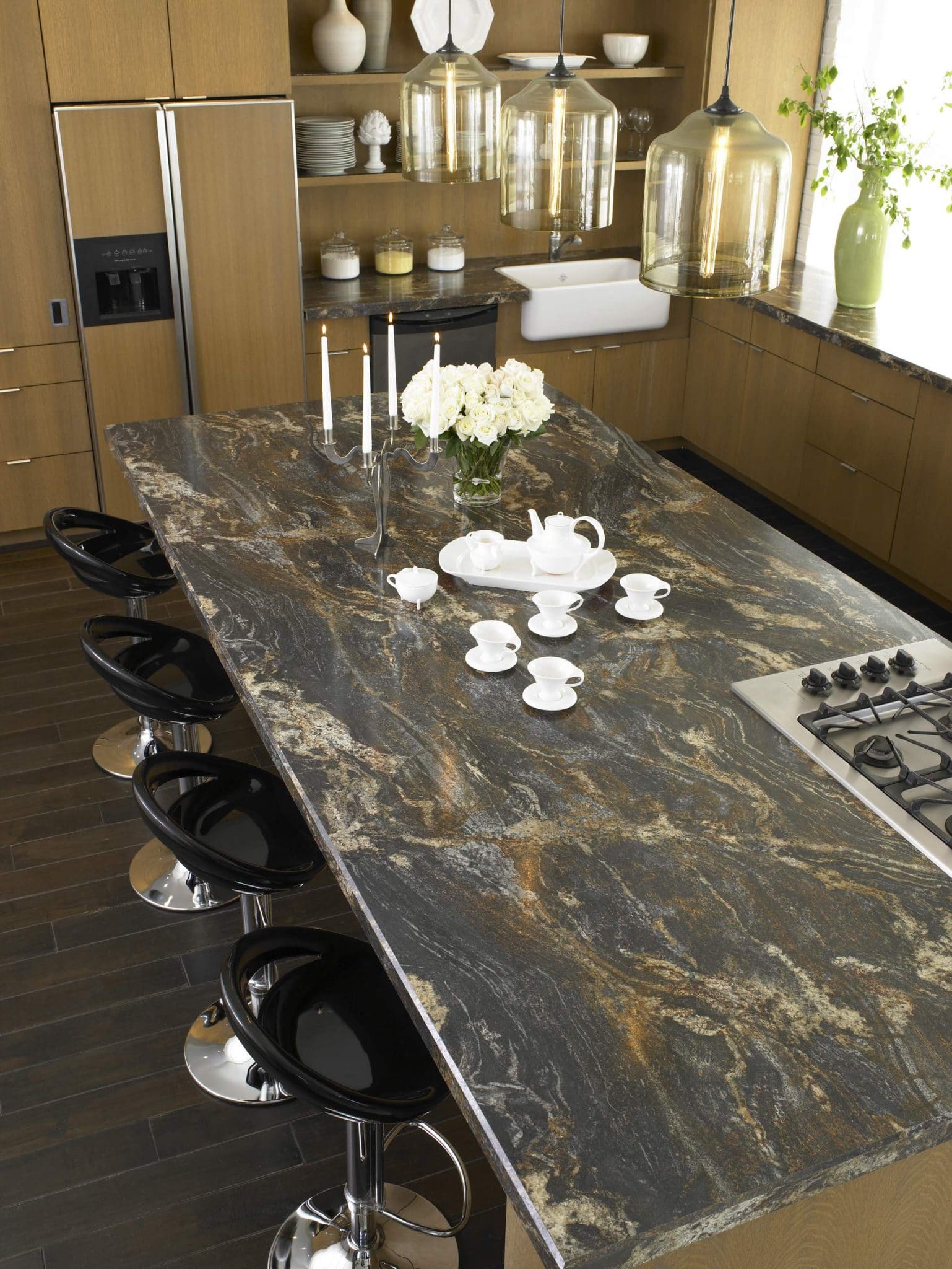 countertops that are otherwise contemporary appear cold. But if you prefer a backsplash wallpaper or upholstery that perfectly reflect the design of the room, so too may a solid countertop help balance the color scheme of it all.
Of course, simplicity may be your intent. There are countertops with a natural pattern or even multiple colors that can serve to even out the scheme of things as well. You can keep the other elements of the room simple, if you prefer. When it comes to a bathroom countertop, the color accents found in your paint, linens and bathroom accessories will enhance the countertop you had chosen. However, if you go with a neutral color for the bathroom countertops it will actually give you more freedom as far as your paint and accessory choices. It’s an ideal place to add flashes of color via your choice of adornments. Again use samples next to your cabinetry, tile and flooring to ensure the undertones do not conflict, but rather emerge harmonious.
Sorry, the comment form is closed at this time.